UX Designer
Enhancing asthma health
with active living

Role
UX Reseracher, UX Designer
Timeline
Jan '22 - Mar '22
My contributions
Project management
User research
Crazy 8s and Dot voting
User flows
Prototyping
User testing
Presenter

PROBLEM
While exercise contributes to asthma health, it is often avoided due to fear of triggering an asthma attack.
SOLUTION
Asthma management platform with an exercise hub where people with asthma can become confident in exercising and managing their condition.
DESIGN PROCESS
01.
Discover
Literature review
User stories review
Affinity diagram
Competitive analysis
02.
Define
Personas
Storyboards
Behavioural analysis
03.
Develop
Ideation
Crazy 8s
Affinity diagram
Dot Voting
User flows
04.
Deliver
Prototype
User testing

01.
Discover
Not only asthma attacks are terrifying events for patients, but they also pose an economic burden to the healthcare system.
It is commonly a chronic condition that requires continuous control and management.
02.
Define the new IA reducing redundancy by clustering content by categories
After gathering the website content, I organized it into themes and sub-themes to create a structured, intuitive layout.
Key user journeys focused on New Patients and Current Patients, who seek different services based on insights provided by the Practice Manager.
For instance, New Patients are primarily interested in accessing registration forms, while Current Patients often look for features like prescription requests or bookings.


Colour scheme used, colour contrast comply with AAA WCAG 2.1
03.
Style guide and prototype
"My Surgery Website" CMS was selected as the website provider. I reviewed their existing components and developed a unique, customised design.
I created a comprehensive prototype, complete with content, to be handed over to the provider for implementation.
The colour scheme was carefully chosen from the brand’s colour palette to ensure consistency.
To maintain alignment, I held weekly meetings with the Practice Manager to review progress and gather feedback.


I adhered to design principles with a strong focus on accessibility and usability heuristics to ensure an intuitive user experience.
For instance, I implemented breadcrumb navigation to help users easily understand their location within the website (aligned with Heuristic #1: Visibility of system status).
04.
Handover and implementation review
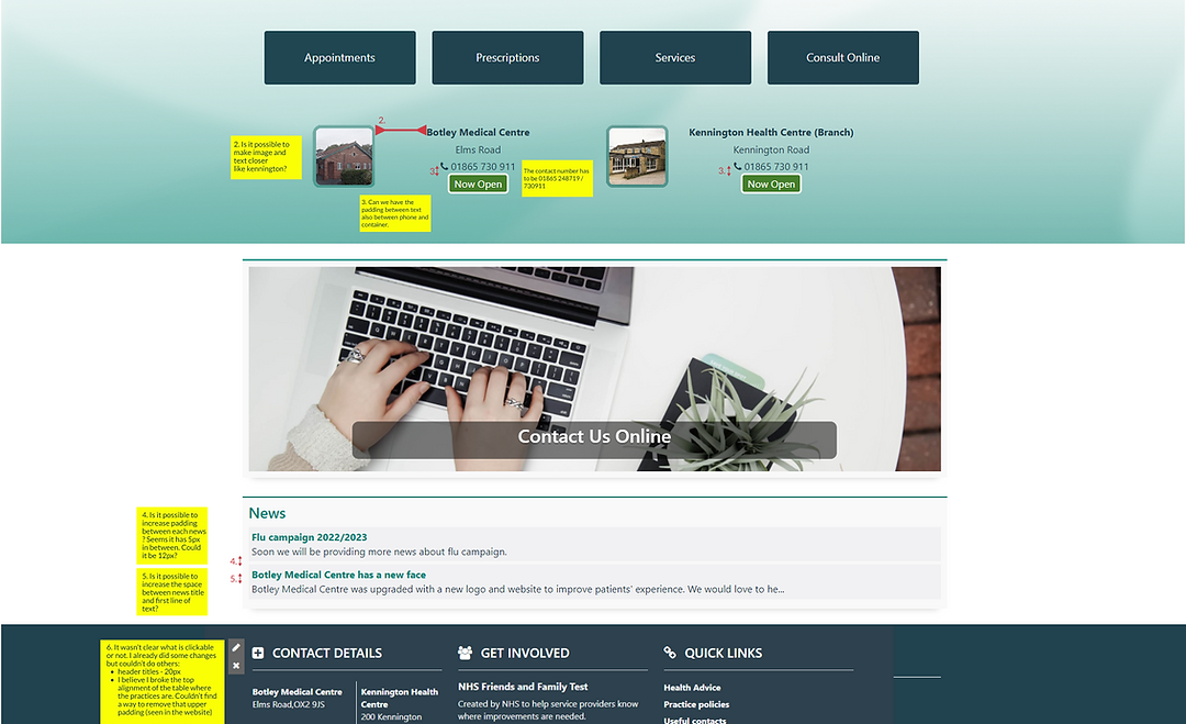
All deliverables (frames and assets) were prepared and submitted for implementation. Before launching, I reviewed the website to identify any inconsistencies with the original designs, enabling iterative refinements for improved accuracy and user experience.


05.
Logo Design
To enhance user experience and brand consistency, I designed multiple iterations of the logo, drawing from the practice’s colour palette as the foundation of the website’s style guide.
The logo design was inspired by the practice's building and its surroundings. The practice acronym was creatively transformed to embody key concepts: health (a heart shape), support (two figures holding hands), and healthcare (a stethoscope).
The font Fredoka was selected for its soft, rounded lines, conveying an inviting and friendly tone.

Several other deliverables were considered and designed such as signatures, practice letters and visit cards for the patients.
REFLEXION
This freelance project involved working within the MySurgeryWebsite design system. Gaining familiarity with their components and accessibility standards was invaluable, while still allowing for unique, custom design elements.
Health-related content is often extensive and complex, and without a well-structured information architecture, it can be difficult to maintain clear organization and user-friendly navigation. For this reason, a big part of my work was to understand all the content required and how and for whom it would be relevant.